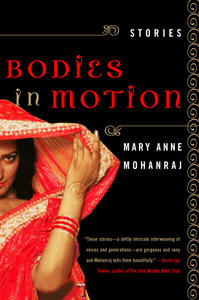
Bodies in Motion: Alternative Revision
I expressed some of my frustrations with the revised cover to my publisher, and while they didn't agree with my assessment that it read as overly sexualized, they did generously attempt to offer me alternatives. I want to take a moment to emphasize here that my editor and art department didn't need to go to this extra effort -- my contract only gave me the right to see the covers; I didn't have any actual right to require revisions, or to sign off on a final version. They extended me that courtesy, and I appreciate the work and time they put into the attempt to satisfy my requests. Unfortunately, the alternatives they presented didn't help all that much.
In this one, we still see:
- only half her body and face
- a red sari
- and a seductive pose / expression
While in some ways you might consider this image an improvement, since at least we do get to see her face, I also found it less striking from a design standpoint. We were also fairly short on time at this point in the process -- the book would be coming out soon, the cover needed to be finalized, there weren't that many options of images of S. Asian women out of then-available stock photography, the budget didn't allow for an entirely new photo shoot, and I was about to leave the country for a month's travel in Sri Lanka. So we compromised.
No TrackBacks
TrackBack URL: http://www.mamohanraj.com/cgi-sys/cgiwrap/mohanraj/managed-mt/mt-tb.cgi/5


Leave a comment